Setting Calculator Layout, Shadow, and Theme Colors #
In this guide, we’ll walk you through customizing the appearance of your calculator using layout, shadow, and theme color settings in the ES Calculator Builder. These options allow you to match the calculator’s design to your website’s branding, making it look more professional and integrated.
Step-by-Step Guide #
Step 1: Adjusting Calculation Settings #
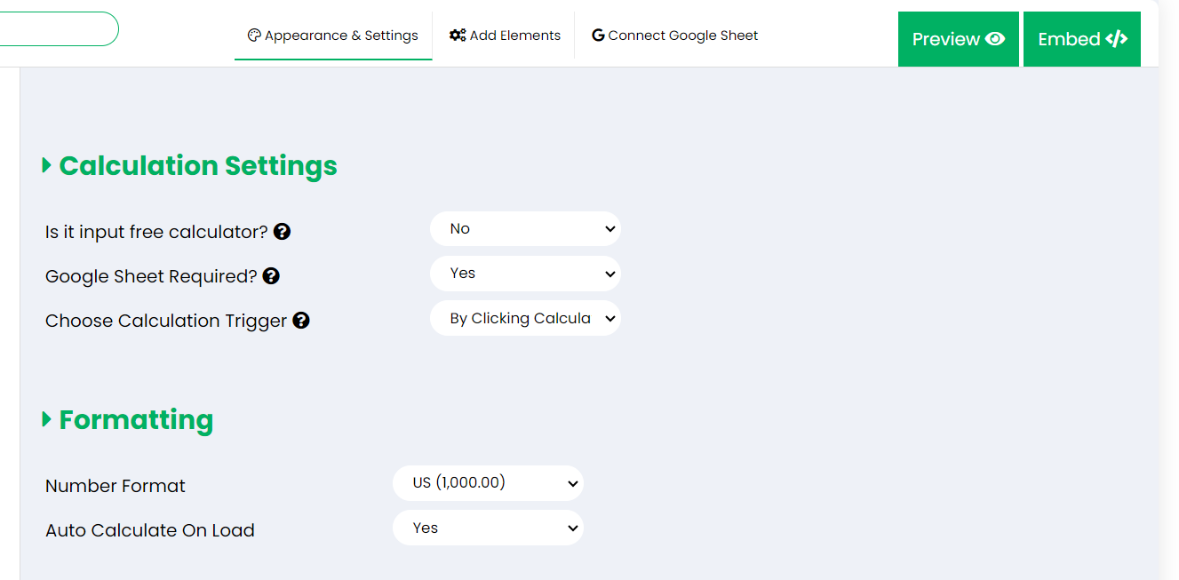
The calculation settings determine how your calculator interacts with data and when it triggers calculations:
- Is it input free calculator? Set this option to Yes if you are creating a calculator that doesn’t require user inputs. This disables the input area.
- Google Sheet Required? Set this to Yes if you want to connect a Google Sheet for backend calculations. Otherwise, choose No if you are using formula fields only and want to create a calculator without G-sheet. (Formula fields can also be used with Google Sheets.)
- Choose Calculation Trigger: Select the condition under which calculations will be performed, such as Re-calculate on an input change or Trigger on button click.
Step 2: Customizing Formatting #
These options help you control how numbers are displayed to match your audience’s locale:
- Number Format: Choose between US (1,000.00) or EU (1.000,00) formats for displaying numbers.
- Auto Calculate On Load: Enable this setting to automatically perform calculations and display results when the page loads, without requiring user interaction.
Step 3: Theme & Shadow Customization #
Personalize the look of your calculator with theme and shadow settings:
-
Theme Color: Set a theme color using a hex code (e.g., #847cfe) or the color picker to match your website’s branding.
You can obtain color codes using online tools like HTML Color Codes. These tools allow you to select a color visually and provide you with the corresponding hex code, which you can use in your calculator for consistent branding and presentation.
- Layout Border Style: Select a style like Round to adjust the border appearance around the calculator.
- Background Color Options: Choose where to apply background colors—input section, result section, or the entire calculator—or leave it with No Background for transparency.
- Shadow: Add shadows to create depth for your calculator. Apply shadows to specific sections or to the entire calculator for a polished look. Use the No Shadow option if you prefer a flat design.
-
Input Style: Choose between Label on input borders or Separate input and labels for better alignment and readability.
Step 4: Configuring Layout #
The layout settings let you control the structure and presentation of the calculator:
-
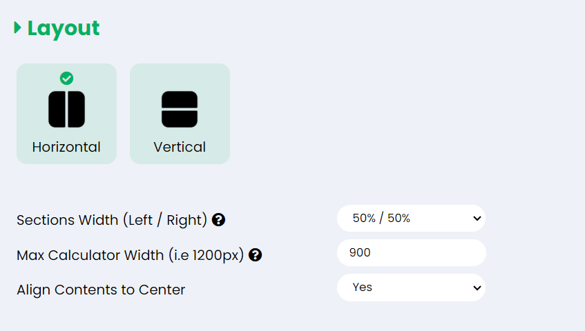
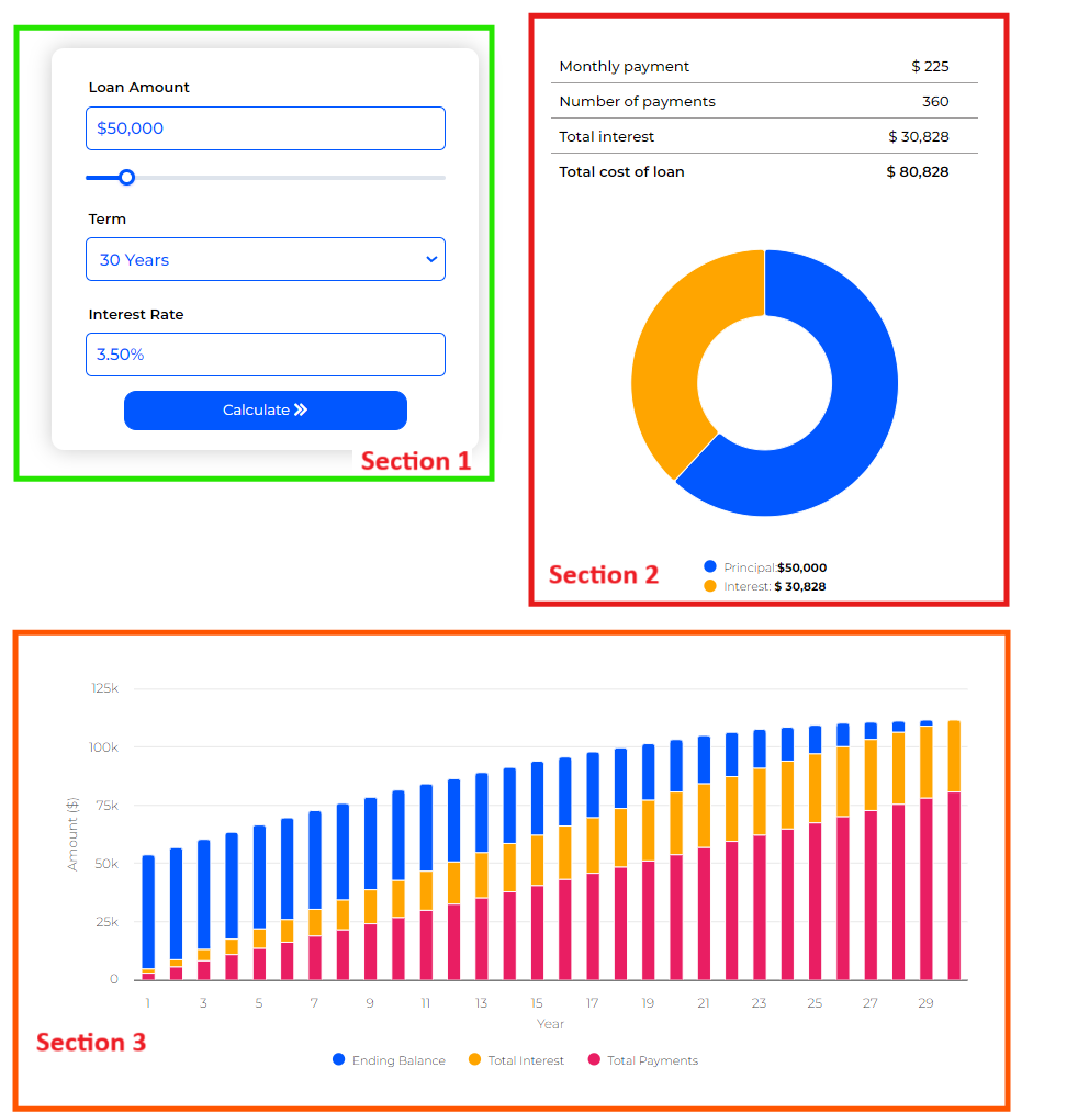
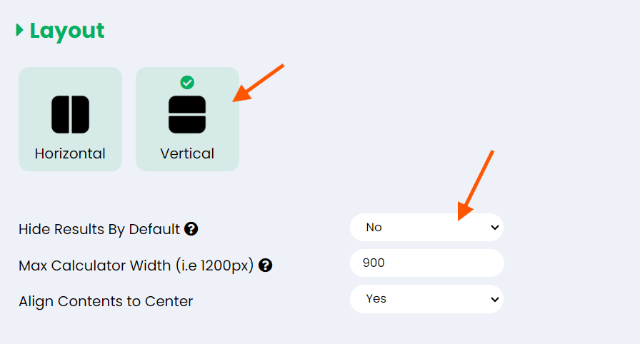
Orientation: Choose between Horizontal and Vertical layouts to arrange the input and result sections side-by-side or stacked. Each calculator created with the ES Calculator Builder is structured into three main sections:
- Section 1: Left Section
- Section 2: Right Section
- Section 3: Bottom Section (Full Width Section)
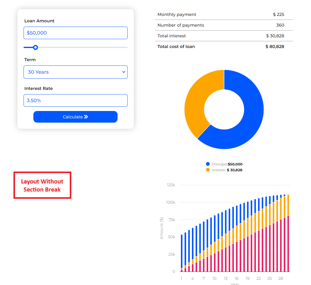
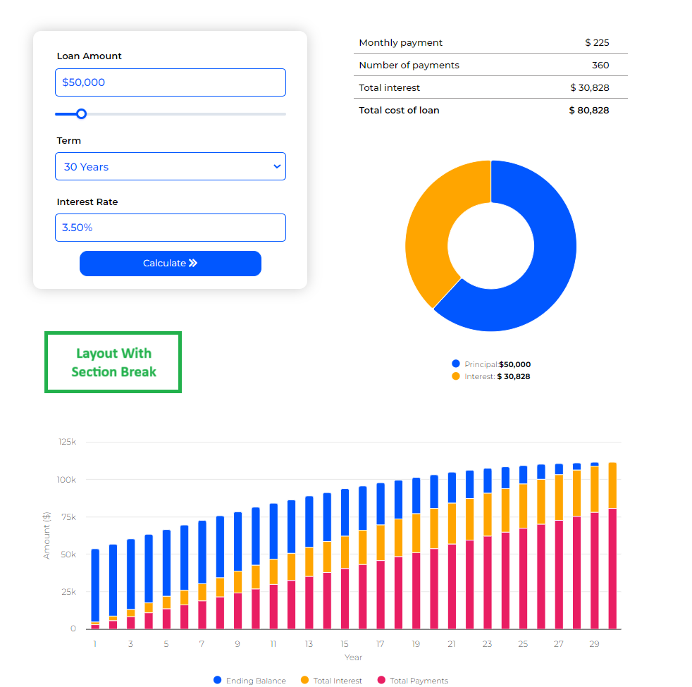
Images below represents a calculator layout with and without bottom section.
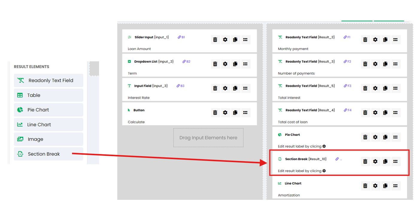
Elements added to the Inputs area will appear in the Left section, while elements placed in the Results area will be displayed in the Right section. To move some result elements to the Bottom section, you can use the “Section Break” element in the Results area.
In the Vertical layout, all three sections are stacked vertically. In the Horizontal layout, the Left and Right sections appear side by side, with the Bottom section displayed below. The Bottom section is only utilized when a “Section Break” element is added to the Results area. Any elements placed after the “Section Break” will automatically move to the Bottom section.
When using the Vertical layout, you have the option to Hide Results By Default. This means that Sections 2 and 3 (the result and bottom sections) will remain hidden when the calculator initially loads. They will only become visible once the results have been calculated.
Please note that this option is not available when using the Horizontal layout.
-
Sections Width (Left / Right): Adjust the width ratio between the input and result sections, such as 50% / 50% for equal distribution.
Sections Width settings are only applicable to the Horizontal (side-by-side) layout.
- Max Calculator Width: Define the maximum width for your calculator (e.g., 900px) for better responsiveness on different screen sizes.
- Align Contents to Center: Center-align content within the calculator for a more balanced appearance.
Step 5: Preview and Publish #
After customizing the appearance, use the preview option to ensure your calculator matches your design expectations. Make adjustments as needed, then click Embed to generate the embed code.
Copy the provided embed code and paste it into your website’s HTML where you want the calculator to appear.
Summary #
With these settings, you can create a visually appealing and user-friendly calculator that aligns with your website’s design. Whether you want a minimalist style or a more detailed look with shadows and colors, the ES Calculator Builder provides the flexibility to achieve the perfect appearance for your needs.
