Universal Elements #
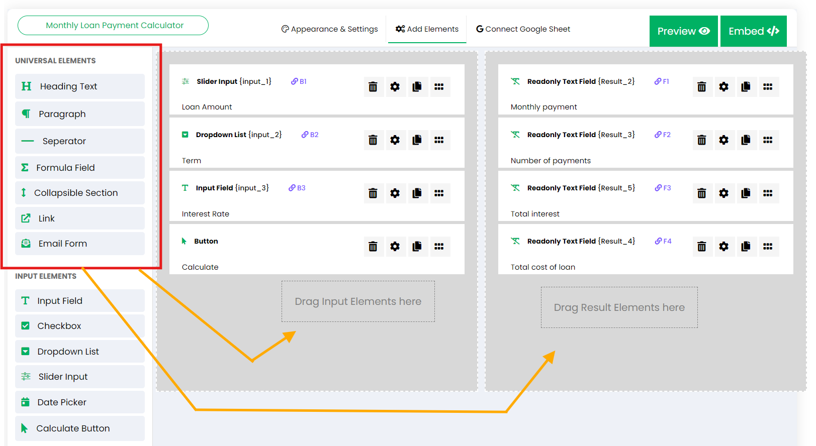
Below is a list of the universal elements you can use when building your calculator. These elements can be added to both the inputs area (left side) and the results area (right side) in the calculator builder, providing flexibility in designing your form.
Heading Text: #
Allows you to add headings or titles in your calculator to organize and highlight different sections, making the form easier to navigate.
Paragraph: #
Adds text content for descriptions or instructions. It supports both static and dynamic content. For dynamic content, you can reference a cell address from a Google Sheet, allowing content to update automatically based on user inputs or other data from your sheet.
Separator: #
A spacer element that adds space between different sections within the calculator, enhancing readability and creating a visually clean layout.
Formula Field: #
A space to define custom formulas or calculations directly within the builder, without the need for external Google Sheets. This allows for real-time calculations as users interact with the form. For more details, visit the Formula Fields documentation.
Collapsible Section: #
Creates sections that can be expanded or collapsed by users, helping to keep the form compact and organized. This is especially useful for calculators with multiple inputs or instructions.
Link: #
Adds hyperlinks to other pages on your website, which can be used for providing additional information or guidance, such as directing users to a contact form, a live chat, or a related page.
Email Form: #
Allows you to add a lead collection or order form directly within your calculator. It sends all user inputs and calculated results to the admin’s inbox. You can customize the form fields (such as name, email, phone, address) and add options like consent checkboxes. Additionally, you can choose which fields to include in email alerts. All submitted responses can be accessed through the admin dashboard in your account. For more information, see the Email Form documentation.
Input Elements #
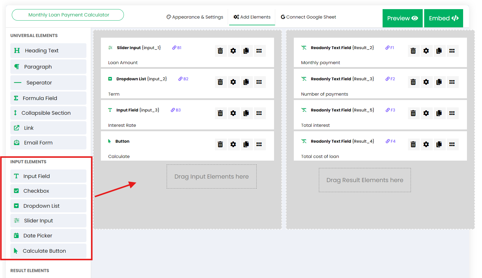
Input elements are interactive fields where users enter data that will be used for calculations. These elements can only be added to the inputs area (left side) of the calculator builder. You can always set the number format of all the inputs in the calculator from the Appearance & Settings tab > Formatting.
Input Field: #
A simple field where users can input text, numbers, or any custom data. It’s versatile and suitable for many types of data entry. You can also select a default option.
Checkbox: #
Allows users to select one or multiple options. This is great for enabling users to make selections that can alter the outcome of calculations. You can also select a default option.
Dropdown List: #
A dropdown menu where users can select a single option from a list. It is particularly useful when there is a fixed set of options to choose from. You can also select a default option.
Slider Input: #
A slider that lets users select a value within a predefined range. This is ideal for numeric ranges, such as percentages, ages, or prices. All slider inputs will also show a manual input option for users who prefer to input numbers manually. You can lock the slider range or keep it open for users to enter any value.
Date Picker: #
Provides a calendar interface where users can select a specific date. It’s useful when calculations depend on time-based inputs. You can set the date format and a default date.
Calculate Button: #
Triggers the calculation based on the inputs provided. This is essential for allowing users to see the results after providing all necessary data. You can rename the button and change the button icon.
Result Elements #
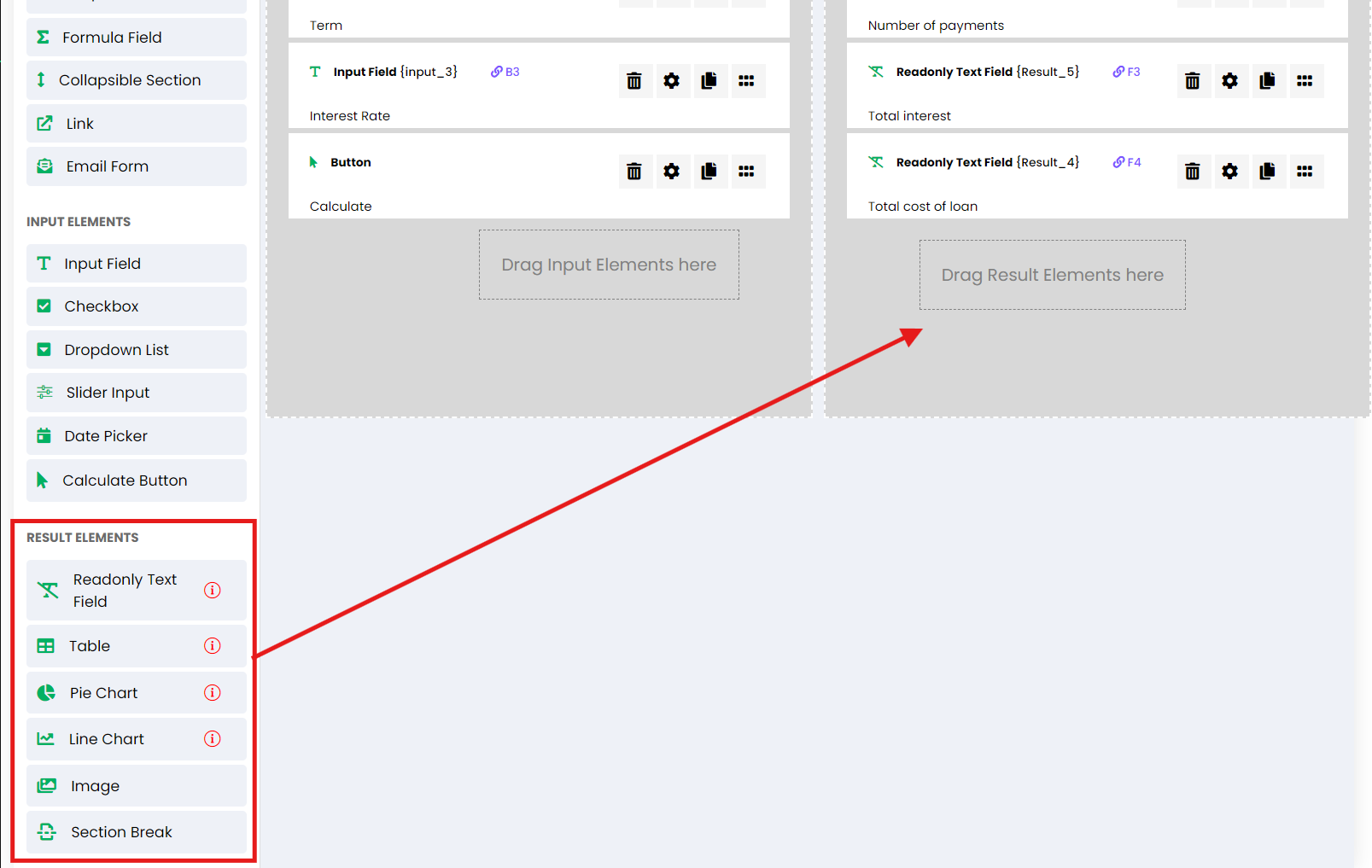
Result elements display the output of calculations, visualizing the data or results generated from the user’s inputs. These elements can only be inserted into the right side (Results Section) of the calculator builder.
Readonly Text Field: #
Displays calculated results or messages that are not editable by users. It is often used to show totals, summaries, or calculated values directly from your Google Sheet.
Table: #
Presents results in a tabular format, making it easy to display multiple data points or detailed outputs. This is ideal for showing a series of calculated data. For more details about displaying data from your Google Sheet as a table, read the table documentation here.
Pie Chart: #
A graphical representation of results in a circular chart format, ideal for showing proportions or percentage-based data. Supports donut charts and pie charts. You can customize series colors and other options. This element can display dynamic data from your Google Sheet. For details on how to display data from your Google Sheet as a chart, read the charts documentation here.
Line Chart: #
Similar to the Pie Chart, the Line Chart offers options for customization, such as colors and series. It is useful for displaying trends over time or comparing datasets. This element can display dynamic data from your Google Sheet. For more information, visit the charts documentation here.
Image (Static / Dynamic): #
Allows you to display static images within the calculator, such as diagrams, charts, or logos. It also supports dynamic images by referencing a cell address from your Google Sheet to read a dynamic URL. You can set the image’s width, height, and other display options.
Section Break: #
Converts a calculator to a 3-section layout: Left, Right, and a third bottom section, allowing for more flexible arrangement of elements. For more information on the available calculator layouts, read the calculator layouts documentation.
Note: Elements marked with an “i” icon, such as Readonly Text Field, Table, Pie Chart, and Line Chart, are only available when the calculator uses a Google Sheet as its backend. These elements rely on calculations or data processed in the linked Google Sheet. For calculators that rely solely on Formula Fields, these elements cannot be used.


